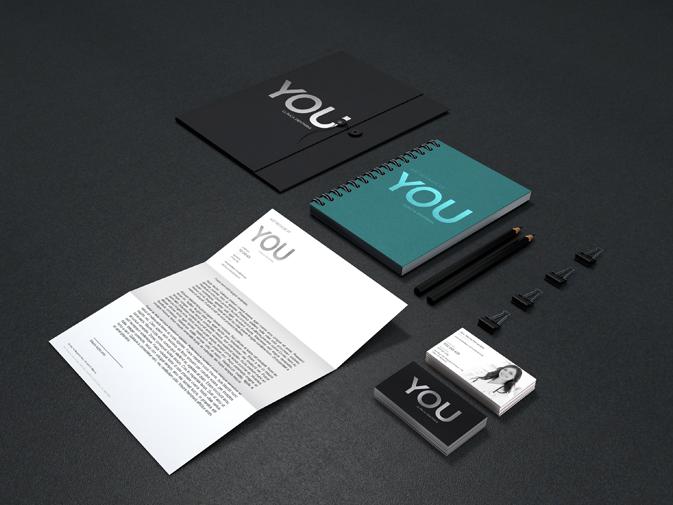
Branding, Naming, Copy Concept, Logo and Brand Design. Space Decoration - Clinic Interior (signage, wall identifiable, internal glass). Decoration abroad: Storefronts, Doors, Light Boxes, Info Boxes. Project with: Design, Production and Application. Website. Web Design and Implementation. Communication media. Corporate identity (business cards, loyalty card, letter sheet, envelopes, custom folders, custom mouse pads). Exterior signage (indicative).
The proposed Briefing was to create a premium brand within the dentistry, in line with a background of professional recognition of the main responsible of the Clinic. One of the cornerstones for the development of the project was the idea of having a targeted clinic for the well-being of people (not only the medical services provided, but also in the service and comfort of the space). This is a clinic created due to the excellent service and therefore designed “for you”.
In this context, the created naming: YOU - Dental Clinic (a name easy to remember and speak clearly assimilated and which clearly achieves the objective of the proposed communication). Because of the concept of excellence (premium) we opted for the use of "black", “white" and "gray silver" as pillars of the graphical aspect. For the logo we used a major font that combines elegance with a graphic structure that guarantees the presence and credibility. Exterior Decoration: Storefronts, Doors, Light Boxes, Info Boxes On the storefronts we used the logo as base inserted into geometric shapes that form a homogeneous sequence with enough presence. In terms of materials we used the frost vinyl, thus combining privacy with the discreet and elegant aspect. On the information signs we have applied one silver gray background with white lettering on acrylic panels. Also, the placement of projectors with targeted focus on those panels. Light boxes (front and flags) with dark gray color background and white lettering (optimal functional contrast), led lighting. Space Decoration We used the same concept of exterior glazing for different partitions (windows) of the interior, giving prominence to the logo "YOU" and the harmony of simple shapes.
For indoor signage, we used circular and homogeneous forms (color: white) with graphic elements contained in themselves (color: silver gray)
As prominent element we positioned the logo "YOU" highlighted in the area behind the counter. For this we used aluminum cropped pieces, applied with spacers on a white wall composed of a raised circles pattern (also in white). Website Temporary web site (responsive) with basic information and a clean chart concept highlighting the images of the “YOU” team. Definitive website running (HTML 5.0 website, responsive, back office total SEO work - Search Engine Optimize)
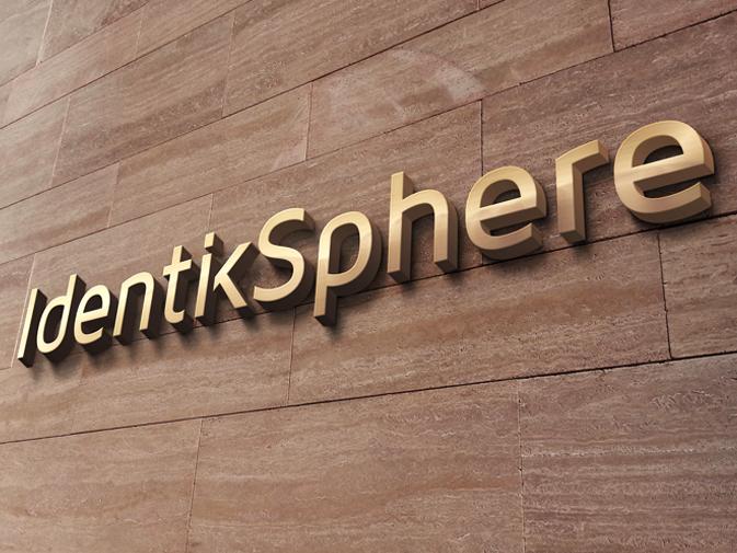
IdentikSphere
Branding Logo Corporative Identity Business Cards
Holding of Cyspresso brand.
As main challenge we have a name with a quite difficult readability. It was necessary to take it and garment it to define credibility and prestige, just as it would add it reading. The result was an elegant logo, modern and with graphics that give "presence" and credibility.
Logo application on business cards and identifying signs (company premises).
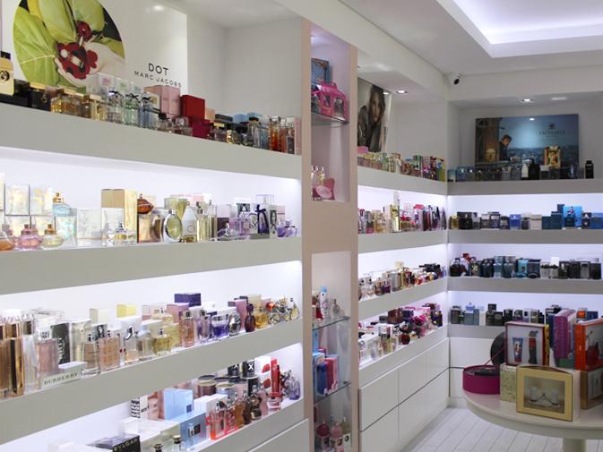
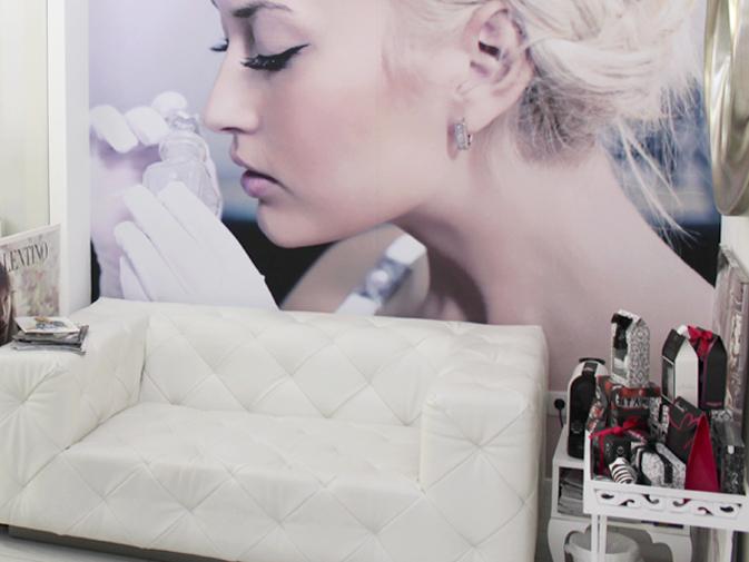
Glam Perfumaria e Estética
Branding and Naming Inspiration on the Glamour concept, where charm and good taste coexist with a modern image directed, firstly, to the modern, informed and fashion woman.
Stationary and communication supports Business cards, loyalty cards, flyers and press ads.
Decoration store space The work focused on two store spaces. First (pre-existing) was based on window dressing (to the outside) and surrounding space, and on the second space we were responsible for designing a store concept created from scratch and that truly met the taste of the company management.
The challenge was to work for a store concept with some specificity (Perfume with Aesthetic and Massage), creating a modern, clean and functional space, to an audience with some requirements, and doing it with the goal of clear positive differentiation over the competition. Interior Design work (total), monitoring implementation, material suggestion. Storefronts design. Vinyls production and application (windows and interior), wallpaper (interior - choice and application), acrylic structures (counter). Website Development of a responsive website (properly adaptable to different viewing platforms, traditional and mobile, and screen resolutions) betting on a concept of a "one page site". Modern design with fashion inspiration, HTML 5.0, “News” editing area managed by the user, SEO work (Search Engine Optimization).
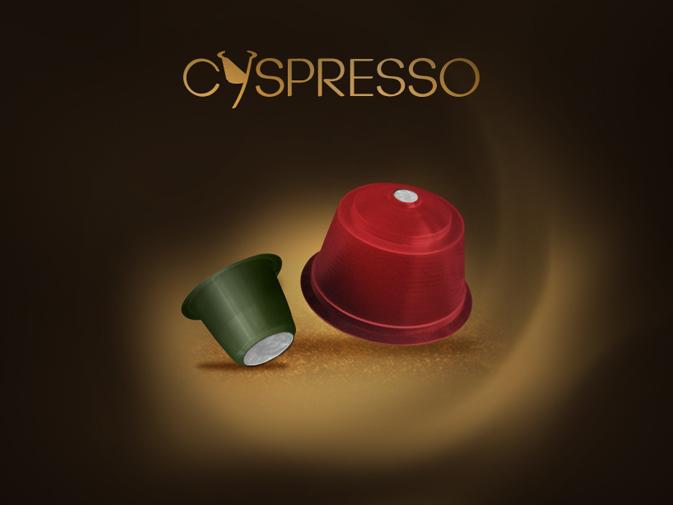
Cyspresso Cafés
Branding
Logo Design and Brand Implementation
Communication Media
Flyer
Packaging
Multifunctional Stand
New brand of coffee capsules, Portuguese, focusing on the international market.
The logo was developed based on a sober and compact lettering, with more circular and optimal reading forms. For better identification of the product context we crafted the “Y” letter for it assumes the contours of a coffee capsule (this solution also resulted on the creation of a logo icon).
Policlínica Clínica Dentária
Branding – Logo
Concept, Brand Design, Graphic Identity
Clinic Decoration
Interiors and Exteriors
Website
Web Design, implementation and back office
Branding Focus on graphics based on cheerful but sober colors, referring to a more relaxed universe (different from traditionally used in medicine or dentistry area) where at the same time the use of elegant and stylish letter transmits the necessity of raising the required standard.
Graphic identity (stationary) - cards, customer cards, folders, letter sheets, envelopes and diverse merchandising.
Decoration and Media Light boxes (LED) in angular disposition (in order to make the best use of available space), informative panel centered between the light boxes with the projector focusing.
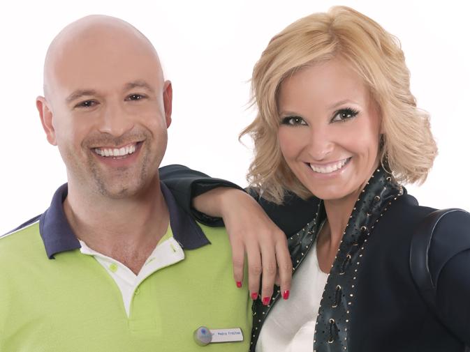
Layout in accordance with the graphic concept and the role of Cristina Ferreira’s photography (TVI host) as "image" of the clinic (photo session was held with the Policlínica team from Malveira and Cristina Ferreira so we could obtain quality images for use in different media brand awareness).
In interior decoration we customized windows, partitions and indoor signage.
Car Decoration - Work on an iconic model van (Volkswagen "Gingerbread Form") focusing on basic colors from Policlínica (light blue and dark pink), pictures graphic framing and children's media icons (the intended use of the van would be disclosure in school activities in the region). Challenge: balancing a vintage car with a concept of modernity and credibility of the disclosed services.
Website Dynamic layout focusing on Policlínica´s team and equipment images. A more informal concept for a better proximity message. Clean and appealing graphics. Website with full back office (user management) and an excellent work in terms of SEO (Search Engine Optimization).
Other promotional media (below the line) - Flyers, posters (clinic activity), banners, roll ups, Facebook campaigns, playful magazine (layout and content) intended for children.
Casa Galrão
Context Celebrating the 70 years of its existence, Casa Galrão (Malveira, Mafra) intended to innovate on its image, remodeling its commercial space (store and surrounding space).
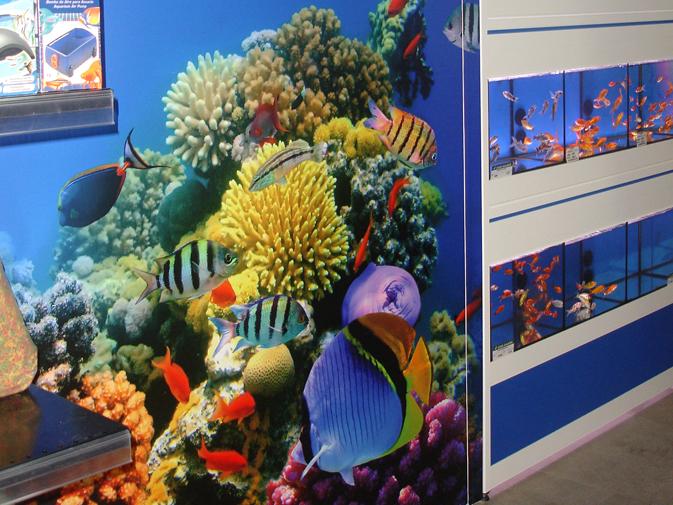
Casa Galrão markets a wide range of products related to agricultural production, feed and pet accessories, aquariums, vegetables, among others.
The basic idea started from the following assumption: innovation, maintaining the tradition of a brand that is almost a historical reference of the western region.
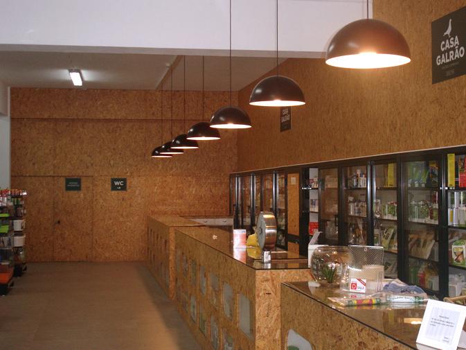
Challenge Creating an appealing image that links a quite rooted operating tradition (with some not possible to change) and a concept of modernity that could expand the brand to new audiences and even to a new commercial dynamic. The space decoration was very important, so it had enough presence of the "warm" and "functional" concepts and at the same time with the imperative of recycling and taking advantage of various existing materials.
Another important aspect would be the organization of different product areas so there would be a balance in terms of visibility and circulation space.
Development BeBrand took this challenge with pleasure: The design and project management, logo rebranding, space decoration, interiors and storefronts, signs, banners, among others. First we worked on the logo rebranding (with application on the requested graphic supports). Then we worked on the store space decoration where we used a recyclable material base (in this case the OSB wood, enabling a focus on a cozy space and, at the same time, connecting the "tradition" with an ecological dimension) in conjunction with the use of banners applied on the ceiling (indicative of "product area"), storefronts dressing (frost vinyl) store entrance decoration (fingerprint vinyl with image), aquarium area decoration (vinyl Wall Art), signs, stoppers for shelves, etc.
Result A successful renovation of a space that came to life with light and harmony and, most of all more functionality.
A project that generated at all levels (clients, BeBrand team and other professionals involved) a high level of satisfaction.
We are based in Loures (Lisboa, Portugal), but we work internationally. For any clarification, help or simple information do not hesitate to contact us.